It takes some real people skills to produce what seems like a simple marketing piece.
Here’s a day-by-day story of how we designed a one-sided flyer for an online payment company in two weeks.
We were asked to produce a PDF flyer that would display its payment service to hair salons. If all sides work quickly a lot can be accomplished quickly.
Day 1: Make the content draft
The first step was to review the features of the payment service, working over the content and changing it a bit, emphasizing both features and benefits.
We also came up with the phrase, “Give Your Cash Flow Problems the Brush-Off!” an obvious play on words for an audience that was a group of hair salons.
This phrase is an emotional appeal and is part of the benefits of a service as opposed to the features. (The client liked it at first, but the phrase didn’t make it to the final version.)
The client also asked for various additions to the flyer.
We’ll try, we said.
There is a danger in that some clients want to put all their service’s features into one flyer, email, sales letter, etc. But this can be overwhelming to the prospect. It’s better to pique the prospect’s interest with just enough information to get them to inquire about it. This is how sales works.

Initial text draft

Artist’s Sample 1

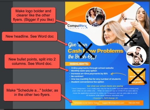
Revision given to artist
Day 4: Logo problems
We gave the content and instructions to one of our artists, Zaniel. He gave us three draft designs. One is shown here, along with the one chosen for the final design.
However, there was a snag. Zaniel remarked that the logo was too small and didn’t look good when expanded to the necessary size. No matter, he said, he could work with it. Zaniel worked his magic and made the logo look good.
Day 9: Some artwork changes
We showed the revised art to our client, who made more changes. We had some suggested changes as well, such as a link to a demo video at the bottom.
There might be disagreements between the designer and the client, but in the end, we allow the client to have their way.
The problem with anything creative is that everyone can think of a thousand tweaks to make it better. That’s why three versions are standard practice in the graphics industry. In other words, after the first version is produced, two revisions are allowed. After that, the client is charged an hourly fee.
After all the changes were made, the final version of the hair salon flyer was an attractive display of the product’s many features, along with a call to action and phone number at the bottom.


